Ingenieurbüro Dr. Böttcher & Dr. Schick
- Logo-Design
- Print-Design
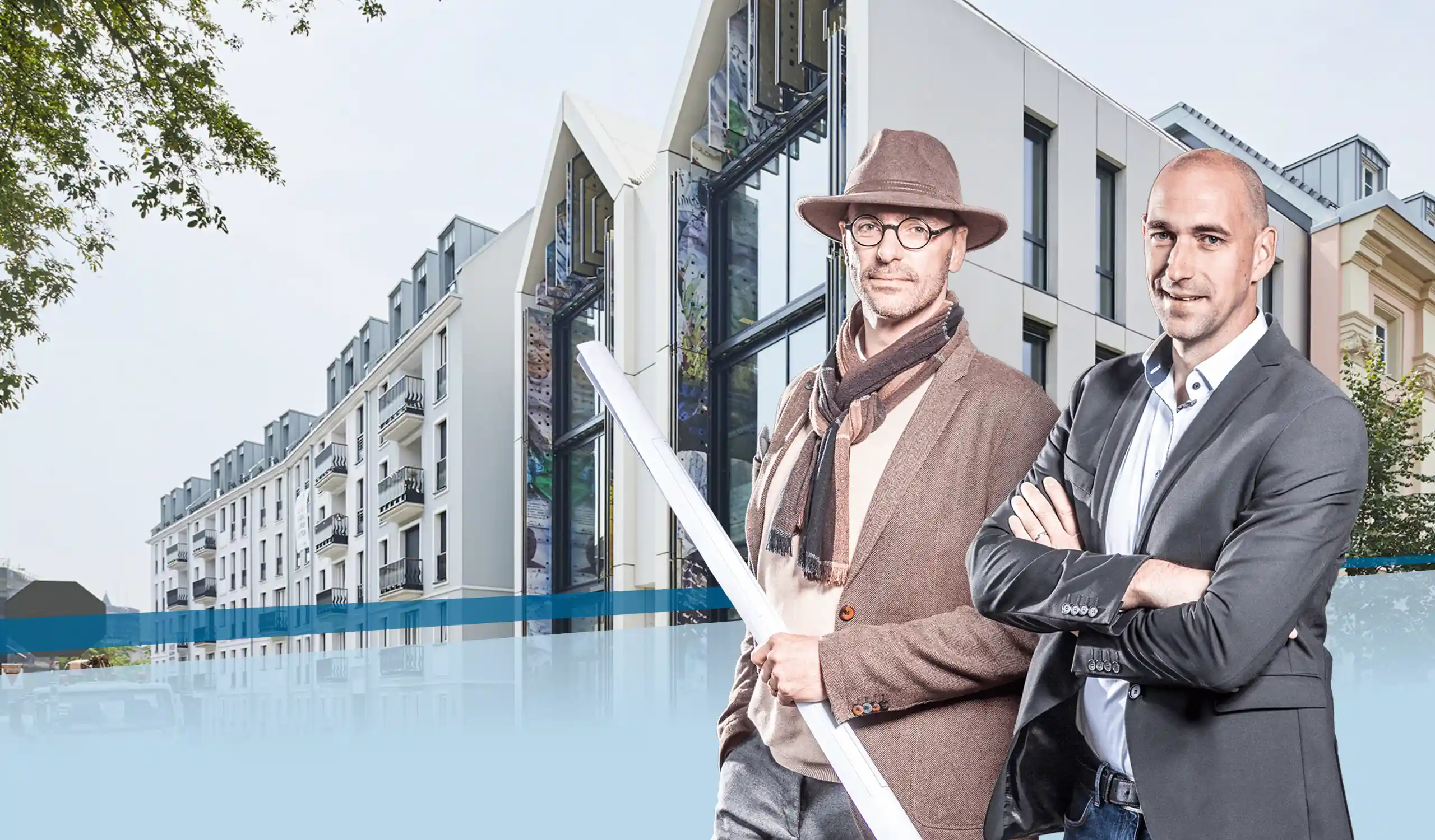
Client: Ingenieurbüro Böttcher & Schick, renowned for 50 years of expertise, is a leading engineering firm based in Wetter-Amönau. Specializing in structural engineering, construction, and building physics, the firm stands out for its commitment to excellence and diversity. With a strong emphasis on collaboration, the team seamlessly blends theoretical knowledge and practical experience. Notably, the owners, both holding prestigious doctoral degrees and actively contributing to research and teaching, ensure that the firm operates at the pinnacle of industry standards.
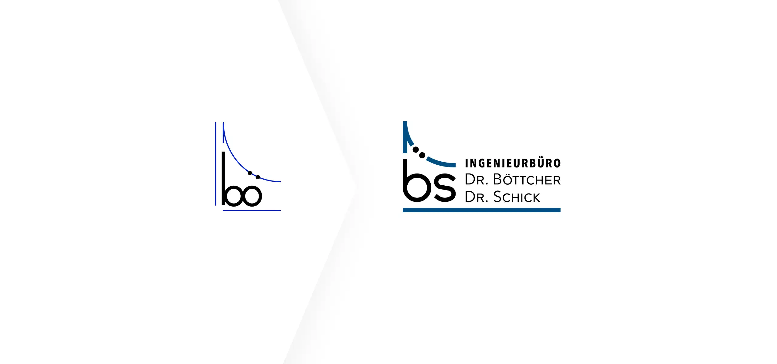
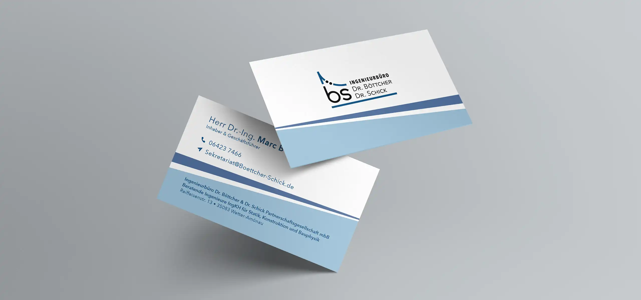
Task: The project kicked off with a strategic rebranding effort following Dr. Schick’s inclusion as a co-owner of the previously named Ingenieurbüro Dr. Böttcher. This shift necessitated a redesign of the logo and the creation of updated business cards to seamlessly represent the new ownership structure.
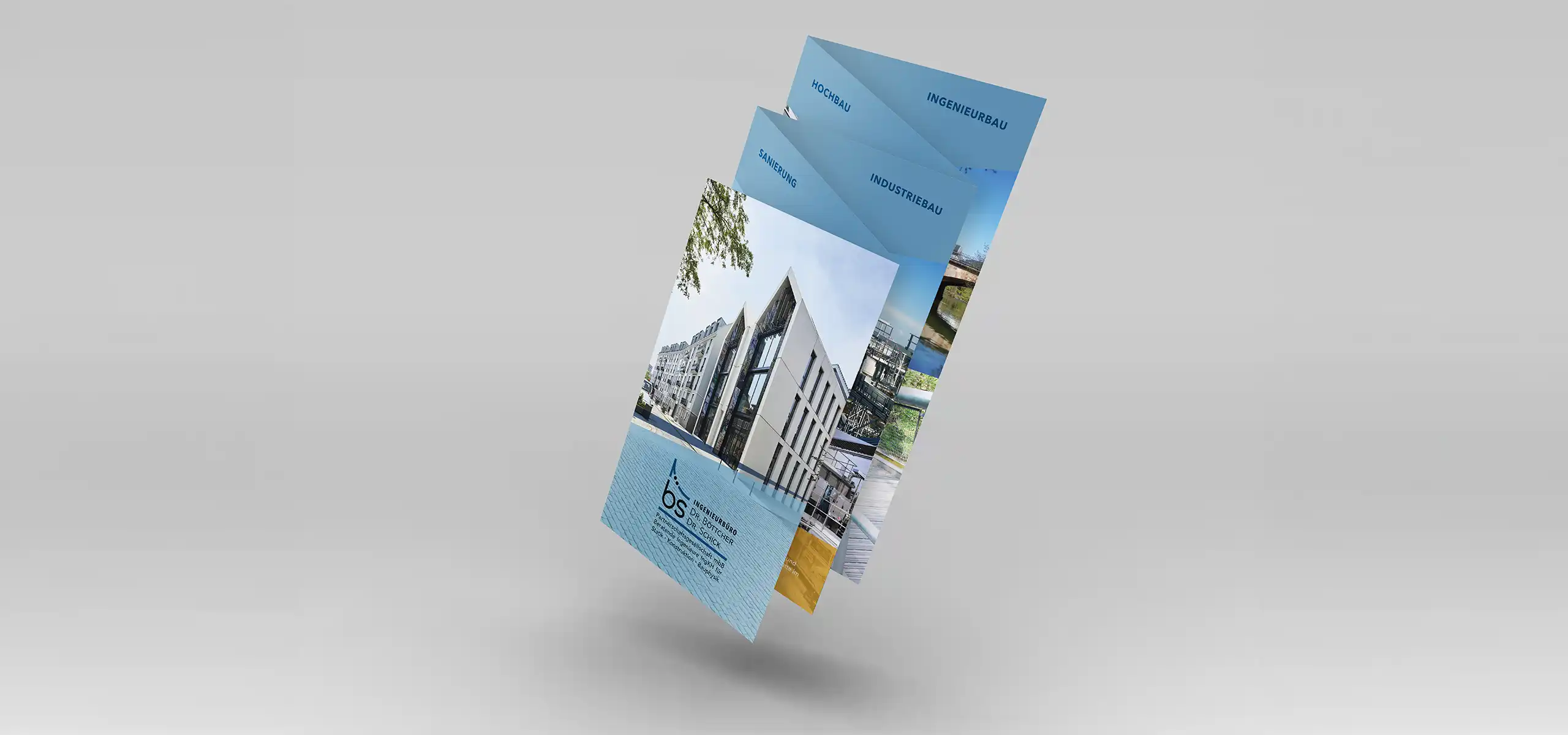
Subsequently, the scope extended to the development of four distinctive brochures, each highlighting the core competencies in Industrial Construction, Structural Engineering, Building Construction, and Renovation. Specifically crafted as versatile inserts for invoices and quotes.
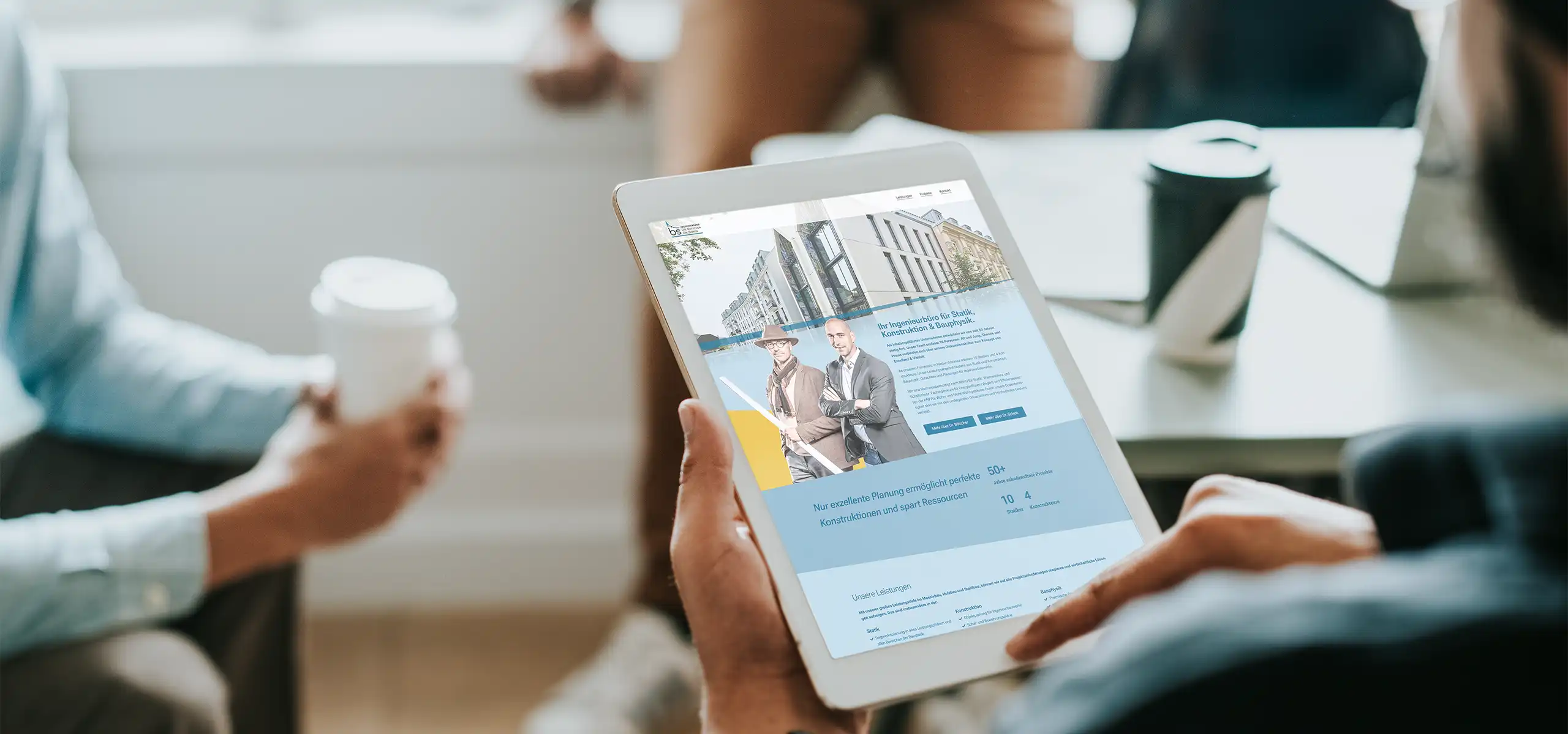
The final step encompassed the redesign and development of a modern website to mirror the updated visual identity. The website’s objective was to efficiently communicate the firm’s services, values, and expertise
Implementation: For the logo redesign, adherence to the client’s wish for proximity to the previous design limited creative latitude. Foundational elements were retained, with a notable adjustment in the elevation of the z-axis for the initials. This modification aimed at enhancing legibility, particularly in website headers. To achieve a modern aesthetic, the stroke thickness was increased, accompanied by subtle font modifications. The result is a logo that maintains continuity while offering improved usability and a contemporary visual appeal.
The project’s standout feature revolves around an innovative brochure design, addressing a significant challenge. The initial plan for separate leaflets presented a potential issue – if a customer expressed interest in multiple areas, they would receive redundant information, duplicating company descriptions, USPs, and contact details. In response, a creative solution was devised by consolidating the four sheets into a 5-fold Accordion Brochure.
The innovative brochure design goes beyond conventional approaches. With a distinctive layout featuring a slanted cut at the top when closed, the design serves a dual purpose. Not only does it catch the eye, but it also functions as a user-friendly register. This allows users to navigate directly to their area of interest, providing a unique and engaging experience. This enables them to navigate directly to the content of their interest, providing a more user-friendly experience and a streamlined handling process for the client, who now only needs to produce and manage a single, comprehensive document.
The website seamlessly incorporated the content and the unique slanted design of the brochure.
Timeframe: 2020
Status: Project concluded with occasional content adjustments and simple print ads.
